Awesome Interface Design
To match the pace, excellent quality web applications have to be developed which can act as the interface for the consumers or target audience of particular services/ products provided by the business groups. Any web application can do its job only if it is designed to meet essential needs of the consumers with a simple, responsive and easy-to-use interface.
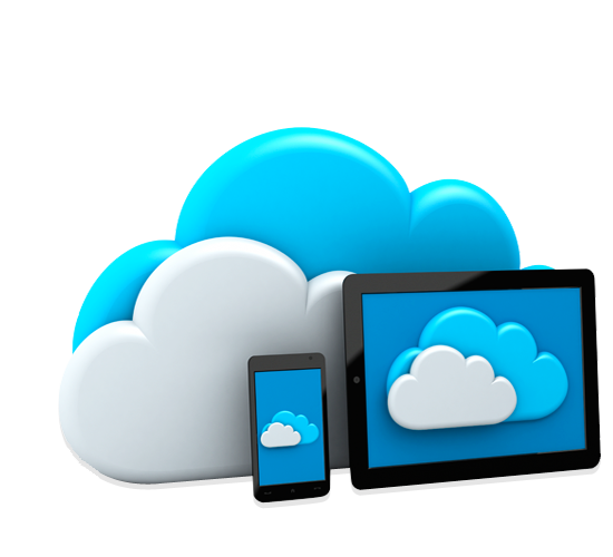
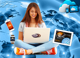
The increased penetration of internet usage has created huge dependency on it. This virtual entity has turned into a living world for us. As a result of this, radical changes are seemingly taking place in the web applications and influencing the way businesses are operated. There is a visible shift from old models to grid and cloud-based models.

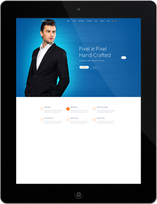
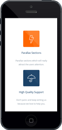
Responsive Design
Responsive web design (RWD) is an approach to web design aimed at crafting sites to provide an optimal viewing and interaction experience easy reading and navigation with a minimum of resizing, panning, and scrolling across a wide range of devices (from desktop computer monitors to mobile phones).
A site designed with RWD adapts the layout to the viewing environment by using fluid, proportion-based grids, flexible images, and CSS3 media queries, an extension of the @media rule, in the following ways:
The fluid grid concept calls for page element sizing to be in relative units like percentages, rather than absolute units like pixels or points.

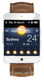
Retina Ready Graphics
So what does the term "Retina Ready" actually mean? It's a phrase coined by Apple with the advent of the iPhone 4. The display size of the iPhone4 is 3.5", at a resolution of 960x 640 pixels. At this resolution, at an optimal viewing distance, the human eye struggles to distinguish individual pixels, so the technology was branded retina display.
Just to give you an idea, on a MacBook Pro with 15" display the pixel resolution is 220 pixels per inch (PPI) as opposed to most older monitors which are 72 (PPI). Again, what does that actually mean? Without getting too technical, basically it means that Retina display devices show more pixels per square inch, resulting in sharper images. A device pixel is the smallest physical unit in a display; there are also different types of pixels, bitmap, CSS etc. On Retina devices, images with higher resolutions (more pixels per square inch) are required.

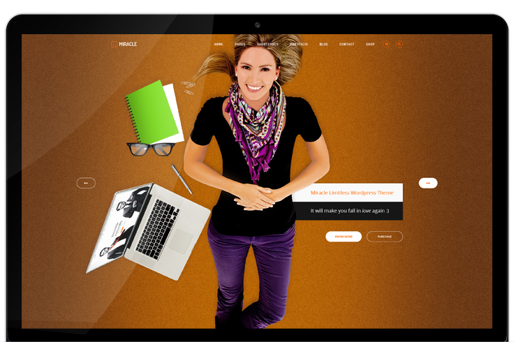
Multi-Purpose Layout
MultiPurpose's goal is to help you build unique and modern websites fast, easy and with the lowest cost possible. With MultiPurpose you can create many unique style websites for differends needs and purposes.


.png)


